I carried out a UX audit combining heuristic evaluation with audience-focused analysis, reviewing how effectively the campaign pages supported different user needs and behaviours.
The audit assessed content structure, messaging hierarchy, calls to action, and accessibility considerations, with particular attention to first-time visitors unfamiliar with National Numeracy or the campaign. Findings were documented alongside practical, prioritised recommendations rather than speculative redesigns.
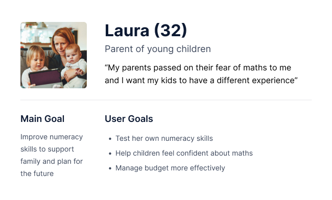
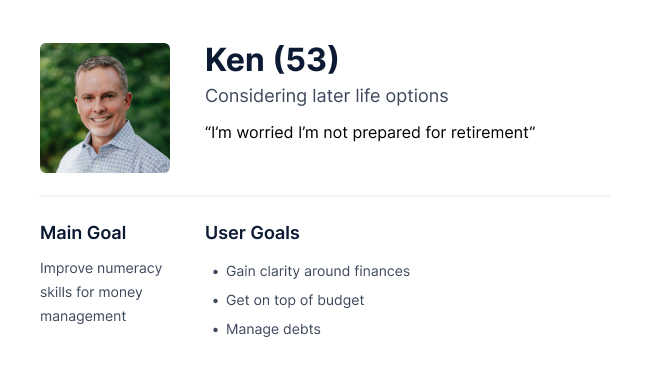
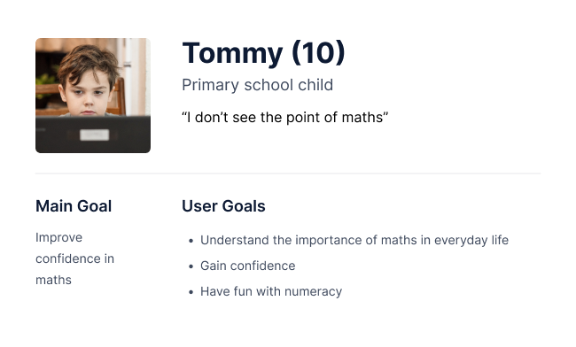
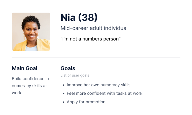
User Personas
I created some lightweight personas to help test whether campaign signposting was clearly supporting different age groups, confidence levels, and motivations.
Key insights
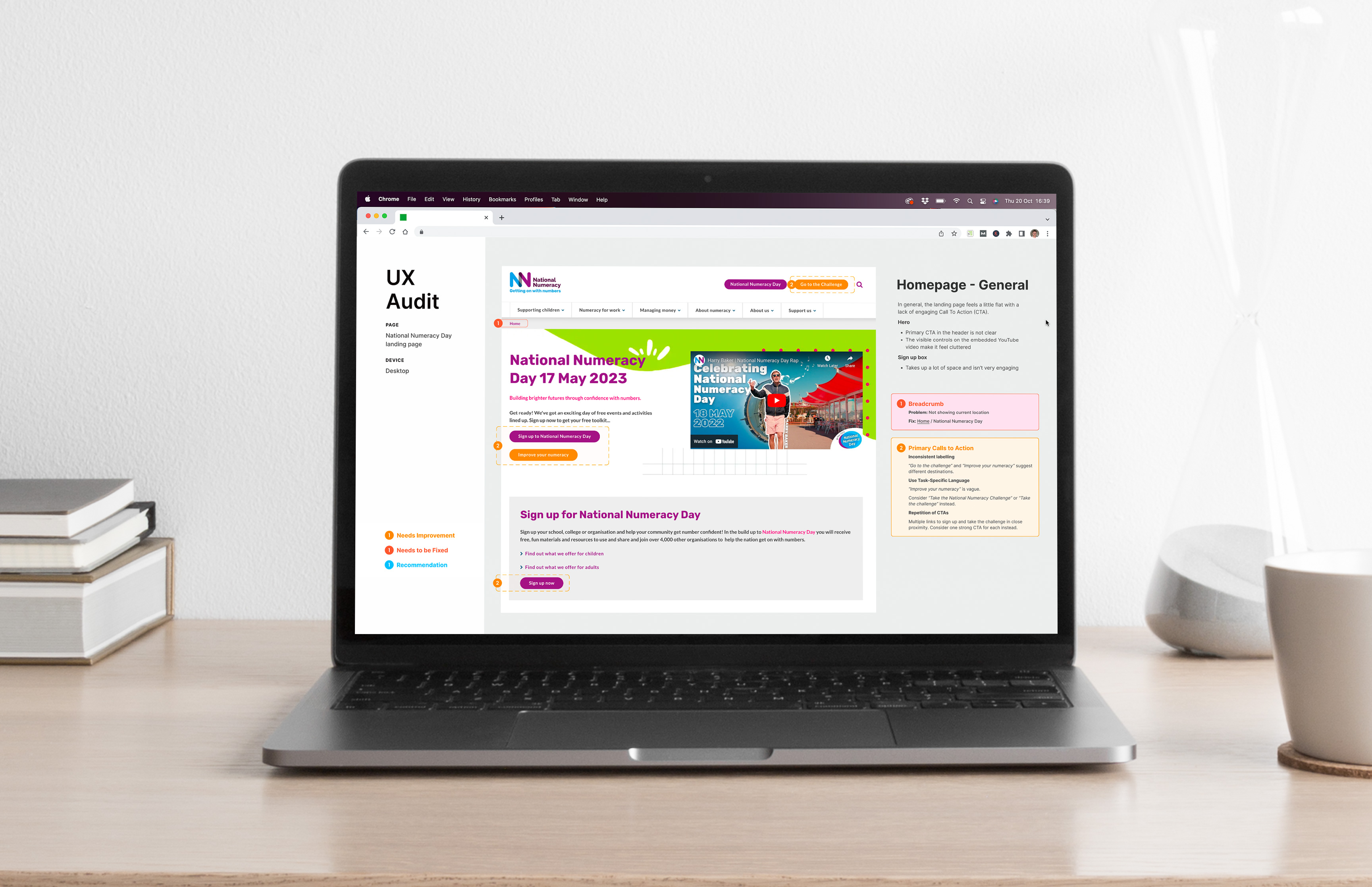
Unclear primary message
The purpose and value of National Numeracy Day were not immediately clear to first-time visitors, particularly those outside education or numeracy advocacy.
Competing calls to action
Multiple CTAs were presented with similar visual weight, making it difficult for users to identify the most relevant next step.
Audience overlap without distinction
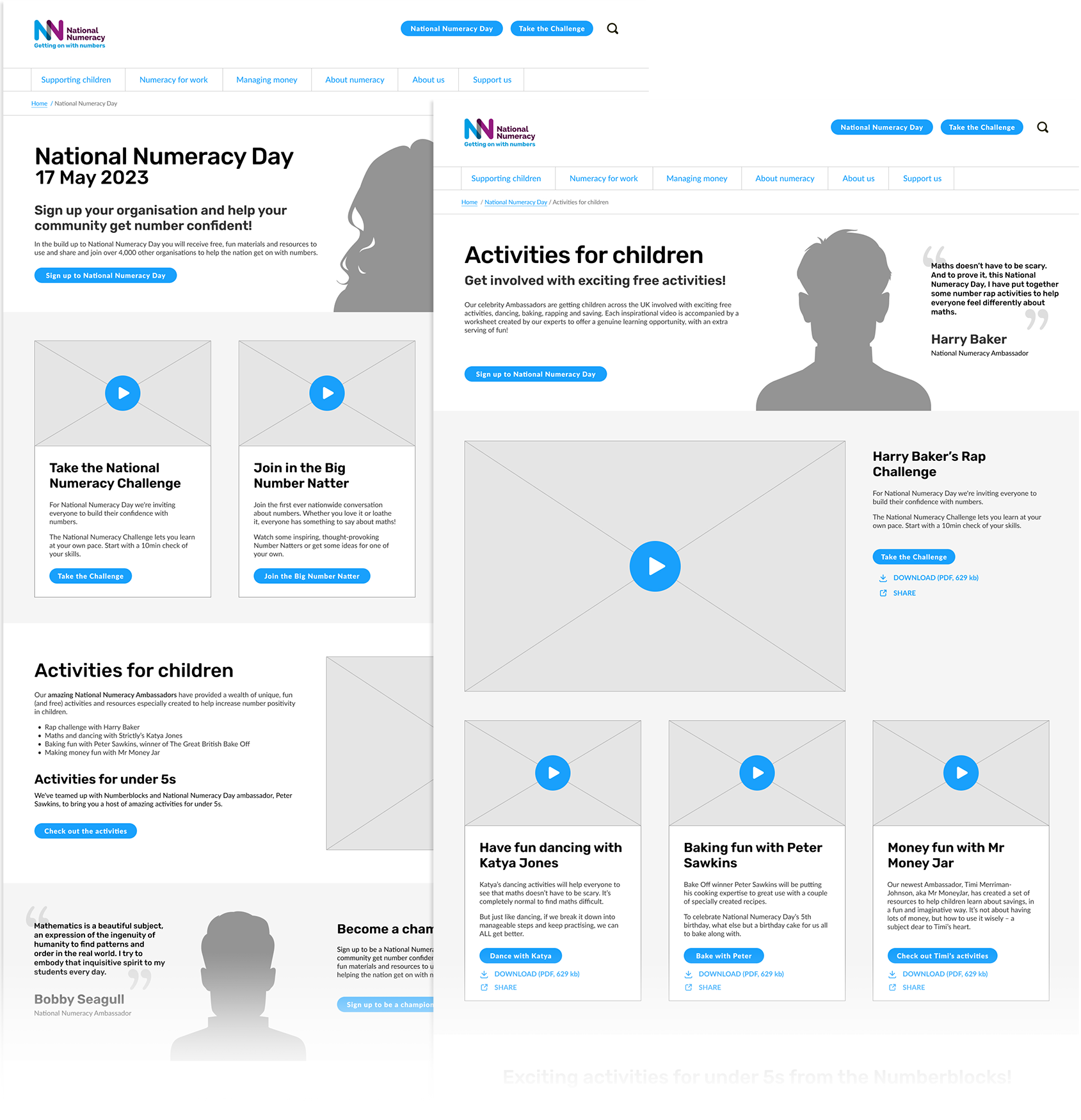
Content attempted to serve adults, parents, educators, and supporters simultaneously, but without clear signposting, leading to cognitive load and uncertainty.
Content density
Important information was often buried within long sections of text, reducing scannability and increasing effort for users seeking quick answers.
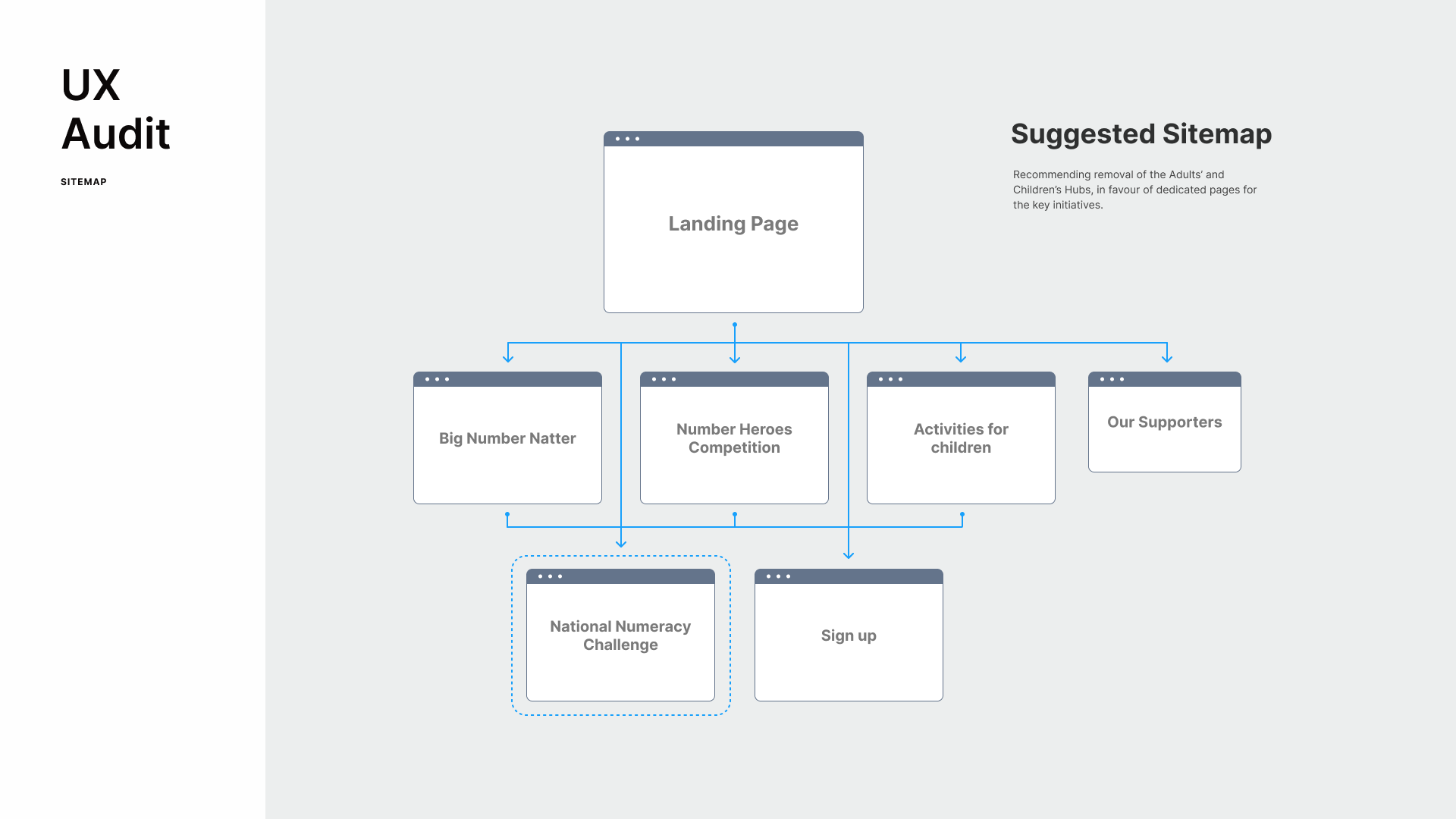
Recommendations
Clarify the primary campaign message and value proposition above the fold.
Introduce clearer visual hierarchy and prioritisation of calls to action based on user intent.
Group content by audience type with clearer signposting to reduce ambiguity.
Simplify and restructure dense content to improve readability and scanning.
Ensure accessibility considerations are consistently applied.